

Initial REW Measurements
After setting up Windows and installing the REW application, I test the hardware and software to ensure that REW functions correctly. The "fun?" part begins with measuring the room's audio performance, followed by an initial analysis to identify possible improvements.
One can perform very extensive measurements with REW and even have REW generate filter parameters to compensate for peaks or dips in a room's frequency response. However, the goals for these measurements are much simpler. Since most of the audio is produced by the front speakers, combined with the subwoofers, the idea was to capture the performance of the front three speakers, combined with the subwoofer, and perform the measurement after running Audyssey room correction. This will result in a good understanding of the overall performance of the more critical audio channels after room correction, which can be analyzed to determine changes to improve the results.
As a reminder, all the screenshots and descriptions were taken using REW Version 5.31.
Last Updated: 04/10/2025
Checking That REW's Working and Setting the Levels
Assuming all the preferences have been set up (as described on this page), the next step is to ensure that REW can properly send test signals to the speakers and that REW can correctly receive audio from the UMIK-1. Once this is confirmed, the speaker volume is adjusted to ensure that the test signal is loud enough to overcome the room's background noise without distorting the results, but not so loud that the speaker is overdriven.
REW's built-in SPL Meter and Generator perform these initial steps. These tools are invoked by clicking on the tool icon. They are shown at the top of Figure 1 and highlighted in yellow and red. Clicking on these brings up the dialog boxes shown below the toolbar in Figure 1. The Generator is highlighted in red on the left, and the SPL meter is in the yellow box on the right.
The Noise option is selected in the Generator dialog box, followed by Pink Random. The Full Range option is chosen because the initial measurements will be taken full range (one speaker and subwoofer together). The level defaults to and should be kept at -12.00 dBFS. The desired speaker output should be selected near the bottom of the dialog box. In this case, the left front is selected. In this example, the left front is selected. When we're ready to check the levels (after setting up the SPL meter), the green play arrow is clicked.
In the SPL Meter tool, the buttons below the numeric display should be set to SPL, C weighted, and S slow time averaging. If the UMIK-1 is appropriately connected, the number display will read some audio and likely change values as soon as the SPL Meter is opened. The meter indicates that the background noise is being detected, confirming the microphone is connected correctly.
Hopefully, once the play button is clicked, the selected speaker will play pink noise. If not, the PC and AVR setup must be checked and fixed. With the pink noise playing, the SPL Meter's reading will increase. To set the proper volume level, the AVR's volume is adjusted until the SPL meter reading is approximately 75 dB (see Figure 2).

Figure 1. REW with the Generator (left) and SPL (right) Dialog boxes opened.

Figure 2. SPL Meter Reading when Generator is Playing
Deciding What Measurements to Capture
The general recommendation for capturing the room response with REW is to set up and take several measurements at different positions that cover the desired listening area. Specific recommendations vary between "experts" and depend on the use case (e.g., home theater, stereo listening, recording studio, etc.). For this initial measurement in my home theater, the goal was to gather data around the Main Listening Position (MLP). Therefore, the original plan was to collect 5 or 6 data points at the positions indicated by the blue numbers in Figure 3. (Later, additional measurement points, shown in green numbers, were added to the measurements.) Data was taken for each of the front three speakers. (Lower location number 5, which is highlighted by a green circle in Figure 3, was not used as it was too low in the seat.) A limitation of only taking data in a small area around the MLP is that other seats in the listening area are not measured and thus not considered. One could measure across a larger area to rectify this and better account for more seats, but I did not.
When measuring a surround sound system, the predominant recommendation for the UMIK-1 orientation is to set it to point straight up and use the 90-degree calibration file. Using a boom microphone stand is a requirement because it makes it very easy to move a mic around the seating area. The procedure was to set up the mic at one position, measure the front left, right, and center speakers, and then move it to the next position.

Figure 3. P Multiple Measurements When Optimizing for MLP (Main Listening Position)
REW Measurement Tools and Graphs
Select the Measure icon from the menu bar (top left of Figure 4) to start. This brings up the Measurement dialog box (Figure 4, below the menu bar), in which some settings should be updated before starting a measurement.
-
Type (yellow)—The measurement type is set to SPL.
-
Name (orange)—This field can optionally set a filename prefix, which helps track which measurement is which. The radio buttons to the right of this setting can automatically add some valuable information to the filename. The added fields are a number, date, and/or output indicator fields.
-
Range (green)—The goal is to capture the home theater's frequency response, so the Range setting should be 20Hz to 20KHz. Figure 4 shows a slightly wider frequency range so that the subwoofer's rolloff below 20Hz can be seen.
-
Length Setting (blue)—This sets the length of the FFT. The larger the number, the more accurate the FFT and the longer the measurement takes. A setting of 256K is precise enough for this measurement.
-
Output (purple)—This setting determines which speaker is tested, and Figure 4 shows the right front speaker being tested.
Regarding the remaining settings, the default values are suitable for these measurements.
(Note: The computer has been set to dark mode, so the screen captures appear as they do. I like dark mode when it is supported, not sure why.)

Figure 4. REW Measurement Dialog Box with Key Paramters Highlighted.
A measurement results window opens after pressing the Start button and completing the measurements. When the window opens, the default view is an SPL graph. An example is shown in Figure 5. Before delving into the details of the measurements and how they were taken, a few not-obvious tools on the window should be noted.
-
Highlighted by the red oval in Figure 5, along the top of the graph are buttons that allow one to select the type of chart one wants to view. By default, the SPL graph is selected. There are several other chart types that I have found useful, and these are discussed below.
-
In the upper right corner (circled in green) are a series of tools that can modify the graph's format. The default display format is reasonable, so modification may not be necessary. The Limits tool can help optimize and specify the chart's minimum and maximum display ranges.
-
Several controls not visible in the screenshot (circled in lavender and purple) become visible when the mouse pointer hovers over the graph area. The +/- symbols zoom in (or out) on the corresponding X or Y axis. The buttons at the bottom right of the graph change the X axis between 10- 200Hz or 20- 20000Hz range.
-
At the bottom of Figure 5, circled in blue, is a list of graph components and check boxes to enable/disable their display. In Figure 5, only the frequency graph is checked.

Figure 5. REW Measurement Dialog Box with Key Paramters Highlighted. The graph uses 1/12 octave smoothing.
Figure 6. Screenshot of REW's Graph Type Buttons.
The graphs that I find most helpful to display during the initial review are highlighted in more detail in Figure 6. They are:
-
Red: This is the default SPL graph. It displays the frequency response of the room and speaker(s). This option displays one dataset, either the most recently generated or the only one selected from the list on the left.
-
Orange: The All SPL chart is very similar to the SPL graph, except that multiple waveforms can be displayed overlayed on top of each other, which helps compare SPL measurements.
-
Yellow: The RT60 chart is one of several graphs that display the time-domain response of the room. Specifically, how reverberant the room is over the frequency range. The following two charts present the same data but visualize it differently.
-
Green: The Waterfall chart also displays the room's time response in a 3-D surface graph. This provides more amplitude versus time versus frequency information than the RT60. However, I find that this chart can be visually cluttered, so I prefer the following chart.
-
Purple: The Spectrogram is a "heat map" type of chart. The main difference is that the amplitude of the sound at each frequency is displayed as a color (instead of the Y axis in the Waterfall chart).
Subsequent sections will discuss and review each of these chart types.
One additional important graph display setting for the SPL graph types is listed separately under the Graph menu item. (Figure 6). This menu allows you to set the amount of smoothing applied to the graph. Without smoothing, the graph looks very "noisy," making it difficult to see the frequency response that human ears would perceive. Smoothing smooths the graph's peaks, making the average frequency response easier to interpret. The Smoothing options that (I think) are most useful are:
-
-
1/3 octave smoothing balances detail and readability. Suitable for general room analysis and EQ work.
-
1/6 octave smoothing is more detailed than 1/3 octave. It provides more details, helps identify specific problem areas, and shows more modal behavior
-
1/12 octave smoothing is suitable for a more detailed analysis of crossover regions and reveals more detail in the bass region, aiding in the analysis of modal behavior.
-
Psychoacoustic Smoothing helps visualize frequency response in line with human perception, applying more smoothing at higher frequencies. It helps assess how speakers will sound subjectively in a room.
-

Figure 6. REW Graph Pulldown Menu Options
Taking Measurements
Very simply . . .
-
Position microphone
-
Select the Measurement tool.
-
In the dialog box, confirm the settings, modify the filename, and select the output speaker. Then, click the Start button.
-
Repeat for each position, then return to #1 until all positions are measured.
Reviewing the Measurements
The following sections, using the measurements taken in my DIY home theater, walk through each of the charts and then review the results for each of the chart types described earlier (SPL, RT60, Spectrogram, and Waterfall).
SPL - Frequency Response
The first thing to examine is the SPL plots. The (messy) outcome of compiling all 5 x 3 data points results in the SPL plot shown in Figure 7, which overlays all the data in one graph. This figure displays the results without smoothing and does not effectively overlay all the plots. A more useful approach that offers a much clearer view of what one's ear perceives is to take the 5-6 plots for each speaker, average them together, and then smooth the average. Figures 8, 9, and 10 illustrate this for the Front Left, Center, and Right speakers, using a 1/12 smoothing factor. With these curves, I can obtain a wealth of valuable information about the room's frequency response and each speaker.
A few basic comments on the SPL curves in general (not the specific measurements):
-
Not using smoothing can be beneficial when focusing on frequencies below ~150Hz, but "smoothing" makes it easier to analyze the frequency response across the full frequency range.
-
For Figures 8, 9, and 10, the frequency response below ~120Hz is nearly the same, which makes sense since this sound is generated by the same subwoofers in all 3 cases.
-
Even with "smoothing" enabled, examining the overlay of all data points is usually not very useful. It is better to look at the individual plots (previously discussed and shown in Figure 5) to identify if any peaks or dips need addressing.
-
It is beneficial to generate an average plot of all the data points. Any peaks and dips common across the individual plots in Figure 7 will manifest as peaks or dips in the average plots (Figures 8, 9, and 10).
-
The goal is to review the peaks and dips in each of the average frequency response curves, and
To address some variations in the desired frequency response, speaker and/or subwoofer placements, seating placement, or acoustic treatments need to be tweaked.

Figure 7. All the Measurements for the MLP (no smoothing). What a mess.
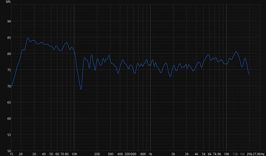
Figure 8. Front Right Speaker Frequency Response Graph Showing Average of All the Measurements with 1/12 smoothing
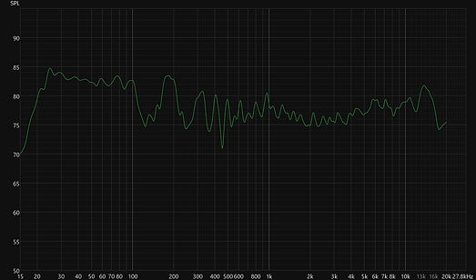
Figure 9. Front Center Speaker Frequency Response Graph Showing Average of All the Measurements with 1/12 smoothing

Figure 10. Front Left Speaker Frequency Response Graph Showing Average of All the Measurements with 1/12 smoothing
Figure 11 updates Figure 10 with some comments regarding specific frequency regions in the SPL Chart. Some additional commentary on some of the observations are:
-
The Bass region between 25-100 Hz is ~5dB louder. (This is probably because I boosted the bass after running Audyssey. 😃)
-
On most measurements, there is a significant dip at ~120Hz that appears to result from a room mode null in most measurements.
-
There are minor dips around 230Hz and 350Hz, possibly due to a room mode or Speaker Boundary Interference Response (SBIR).
-
The speakers are boosting frequencies above ~5 KHz. This seems likely to be a characteristic of the speakers. The speakers were "toed-in" to point directly at the main listener. A possible fix for this is to not point the speakers directly at the listener, instead pointing them straight ahead so that the listener is slightly off-axis.
-
There is another dip in common (between the plots) that occurs around 2.2 KHz, which may be due to the speaker's frequency response.

Figure 11. Frequency Response Graph for on Speaker Showing RMS Average of All Measurements and with Comments on Aspects of the Response.
Reviewing the RT 60 Chart
Another key aspect of achieving good home theater sound is understanding how the room reverberates. In other words, how long do sounds bounce around the room? Too much reverberation makes the audio sound muddled; too little makes the room's audio "dry" and unnatural. REW's RT60, spectrogram, and waterfall charts offer various methods for visualizing a room's time-domain response across its frequency spectrum. (Note: RT60 is described in more detail on this page.)
Various reference materials recommend that the ideal RT60 value for a small room (the type of room being measured here) should be between 200- 300 ms, rising to ~500- 600 ms in the bass region. CEDIA's RP22 also contains a similar recommendation (see Chapter 9). REW's RT60 graph plots this information. A measurement for this DIY theater is shown in Figure 12. In this graph, REW does not exactly create an RT60 graph because (as stated in its documentation) it is problematic to generate this data in the bass frequencies. REW generates a curve called Topt, along with other decay curves.
In Figure 11, the Topt curve is the green highlighted curve. REW generates this curve from individual measurement data, not a plot generated as an average of multiple individual measurements. Also, the curve does not create data below ~50Hz.
Reviewing the measurement results shown in Figure 11, the Topt ranges from 200-300 ms between 70 Hz and 10 kHz, which is within the desired range. However, below 70Hz, the Topt value rises quickly. While this result still appears roughly within the desired range, the decay times rise quickly, and likely would continue to rise below 50 Hz. This rise in Topt indicates a possible lack of bass trapping in the room. (However, it is usually preferred to tame very low-frequency resonances using multiple subwoofers.)

Figure 12. An Example RT60 Plot Left Front Speaker. This shows all the different Decay Curves REW generates. The Topt is Highlighted in Green.
Spectrogram
Another way to interpret this information is through the Spectrogram chart, an example of which is shown in Figure 12. This graph displays the energy at each frequency over time, with a color heat map representing energy levels (red indicates the highest energy, and dark blue represents the lowest). From this graph, one can deduce decay times at various frequencies. As can be seen, the decay times above 100 Hz appear to be below ~250 ms, which is within the desired range. The chart reveals increases in decay times at lower frequencies, specifically above 600 ms. Specifically, there are a couple of very long decay times around 25 Hz and 45 Hz. Even at the lower frequencies, the results are reasonable, although it would be helpful if those delay peaks could be reduced.
It is also possible to correlate the peaks and dips in the SPL graph with the corresponding frequencies in this chart. Notice that around 120 Hz, there is an energy gap, and there are smaller ones in the 200- 300 Hz range.

Figure 12. Example Spectrogram Graph
Waterfall Chart
The last chart example to review for initial room measurements is a Waterfall chart (see Figure 13). This chart is another way to display the same information as in the Spectrogram, but in a three-dimensional surface model. The same observations mentioned above also apply here. The decay times are well-behaved and less than 300 ms above ~100 Hz. One can also observe a long decay at around 25 Hz, which may be partly due to a room mode.

Figure 13. Example Waterfall Chart.
Potential Next Steps
Armed with measurement data for the center, left, and right front speakers, a next step could be to experiment with changes to improve the audio. Some of the frequency peaks and dips shown in Figures 8-10 may be addressed by changing the speaker, subwoofer placement, and/or adding acoustic treatments. It becomes an iterative process of making changes and rerunning Audyssey, as well as rerunning REW to verify the impact of those changes.
Furthermore, one can use Audyssey's MultEQ app to adjust the target curve or use the MultEQ-X Windows application to manipulate Audyssey's filters and compensate for audio performance more directly.
The two pages explore some of the above-mentioned next steps and the results, starting with a description of the MultEQ application.